A Design System Is Not Just a Style Guide; Here’s Why
Many teams confuse a design system with a simple style guide. But they are not the
same. A style guide only tells you how things should look. A design system explains
how things should look, behave, and grow together.
It becomes a shared language for designers and developers. It removes guesswork and
builds clarity. Instead of making fresh decisions for every page, the team follows
one clear structure. That structure helps products stay consistent as they expand.
A design system is built on these essentials:
-
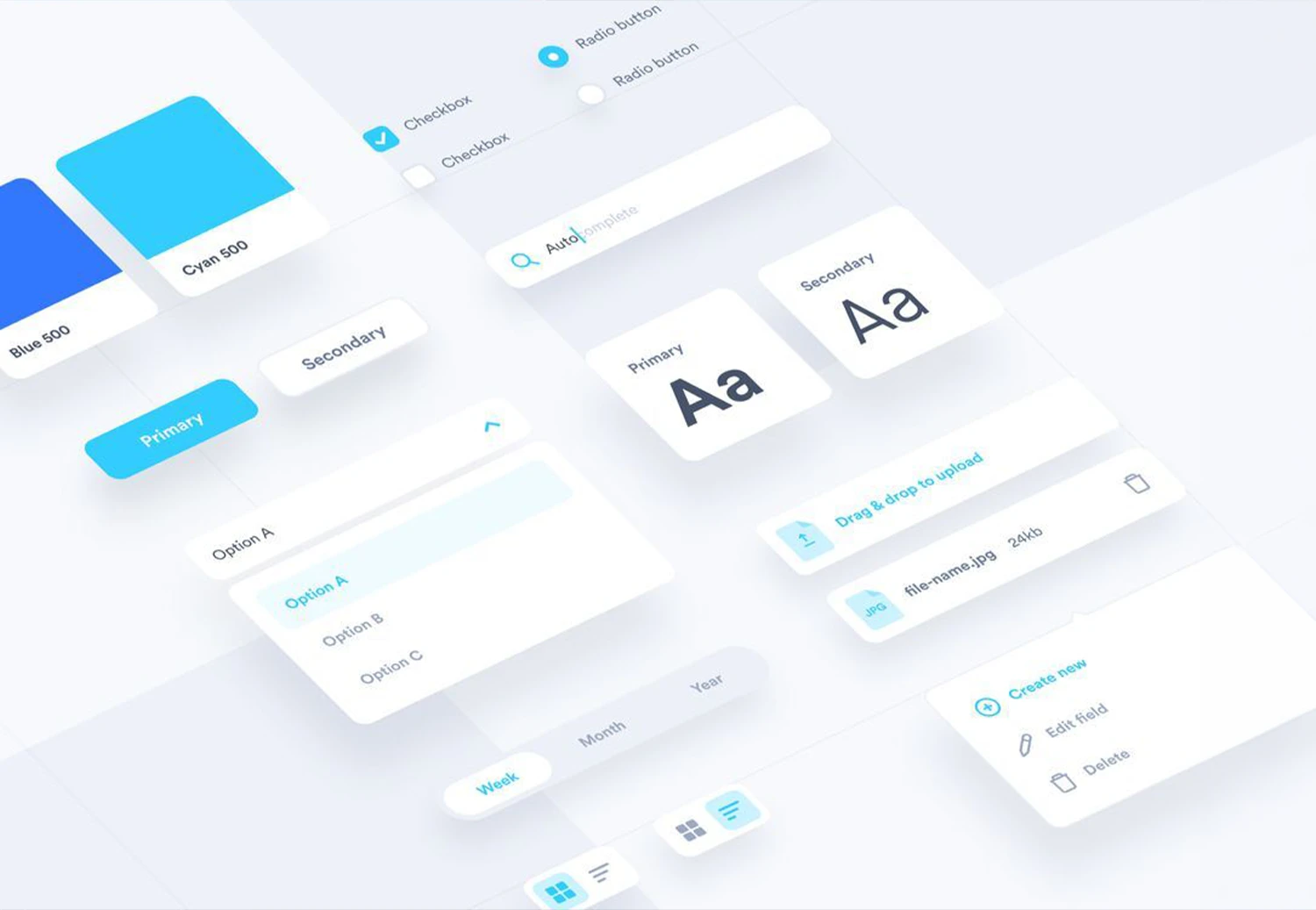
Design Tokens
These are the core visual rules of your product. They set fixed values for
colors, fonts, spacing, border radius, and shadows. Instead of choosing
styles again and again, the team follows one clear set of values. This keeps
every screen neat, balanced, and consistent.
-
Reusable UI Components
These are ready-to-use design blocks such as buttons, forms, modals,
navigation bars, and cards. Rather than creating a new button each time, the
team uses the same approved version everywhere. This saves time and keeps
the look uniform.
-
Interaction Patterns
These explain how elements should work. How should a dropdown open? How
should a form show an error? Clear action rules make the product easier to
use and reduce mistakes.
-
Documentation
Documentation clearly explains how and when to use each component. It guides
designers and developers step by step. With clear instructions, there is
less confusion and faster work.
-
Governance Rules
Every design system needs ownership. There must be clear rules for updates
and approvals. When someone manages it properly, the system stays organised
and useful for the long term.
Why Growing Web Teams Struggle Without a Design System
As web teams grow, design problems become more visible. There is no consistent theme
across the entire application, so pages feel mismatched and confusing. Each
interaction is built differently, which makes the user experience random and
sometimes buggy.
It also becomes harder to track product changes and new requirements over time.
Without proper documentation for use cases, teams depend on memory, which slows work
and creates costly mistakes.
How Design Systems Improve ROI in Web Development Projects
Faster Development Cycles
A shared component library saves time. Teams reuse approved designs instead of
rebuilding features. This reduces delays, avoids repetition, and helps products
launch quicker without sacrificing quality or consistency.
Lower Long-Term Costs
Clear design standards reduce rework and prevent repeated fixes. Teams spend less
time correcting UI issues. Over time, this cuts maintenance expenses and keeps
development budgets under control.
Stronger Brand Consistency
When every product follows the same design rules, users experience one clear brand
voice. Consistent visuals and interactions build familiarity, which helps customers
feel confident and connected to your business.
Easier Product Scaling
As your platform grows, new features fit naturally into the existing design
structure. Teams expand products without breaking layouts or confusing users, making
growth more stable and manageable.
Improved Collaboration
With one shared design reference, teams avoid misunderstandings. Designers,
developers, and testers speak the same visual language, reducing confusion and
helping projects move smoothly from idea to launch.
When Should Your Organisation Invest in a Design System?
A design system becomes important when growth starts creating confusion instead of
clarity. If your company manages multiple digital products, adds new features
regularly, or hires more designers and developers, structure becomes necessary.
Frequent UI inconsistencies and repeated design decisions are clear warning signs.
At this stage, building a shared design foundation is not optional; it is a smart
move to support stable, long-term growth.
How Web Teams Can Start Building a Design System
A strong design system starts with small improvements. Follow these five focused
steps to bring consistency and better organisation to your web projects.
-
Step 1: Audit current UI inconsistencies
Carefully review all digital products. Compare buttons, fonts, layouts, and
spacing. Identify repeated mismatches and patterns that create confusion or
weaken user experience.
-
Step 2: Standardize core design elements
Define one approved color palette, typography scale, and spacing system. Fix
border styles and layout grids so every new screen follows consistent visual
rules.
-
Step 3: Create shared documentation
Document usage rules for each element. Explain when to use components,
spacing values, and patterns so designers and developers follow the same
guidance.
-
Step 4: Build a reusable component library
Create reusable components like buttons, forms, and navigation bars. Test
them across devices and store them in a shared repository for easy access.
-
Step 5: Assign ownership and governance
Appoint a responsible team to manage updates, review changes, approve
additions, and maintain consistency as products evolve and teams expand.
Conclusion
Modern web teams need more than creativity. They need structure, and a design system
gives that structure. It reduces confusion, improves teamwork, and keeps every
digital product aligned with your brand.
Instead of solving the same design problems again and again, your team works with
clarity and focus. Over time, this saves money and strengthens quality.
If your digital products feel inconsistent or difficult to manage, now is the right
time to make a change. At Webomindapps, we help businesses plan, build, and manage
practical design systems tailored to their goals.
Let’s connect and create a stronger, more consistent digital foundation
together.


