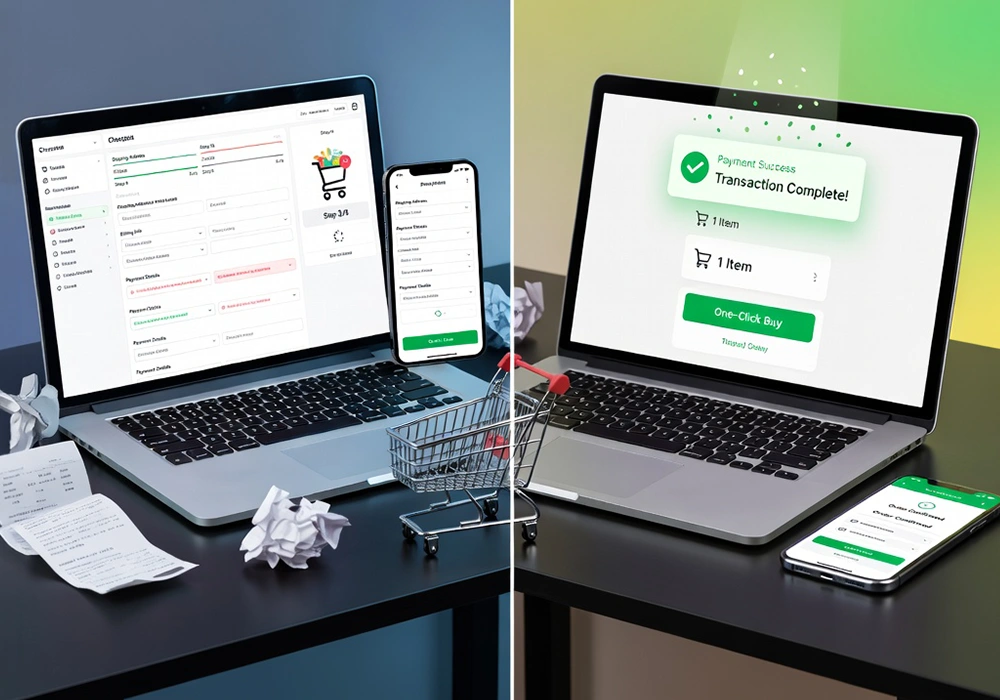
A smooth checkout experience helps customers complete their purchase without hesitation, while a complicated one creates friction at the worst possible moment.
In this blog, we’ll break down practical ways to make the checkout process faster, simpler, and more user-friendly, based on common patterns seen across successful eCommerce platforms.
Why a Poor Checkout Experience reduces Your eCommerce Sales
The checkout stage is the closest point to conversion, yet it also records one of the highest drop-off rates in online shopping. Many leading eCommerce studies show that a large percentage of users abandon carts during checkout, not because they changed their mind about the product, but because the process felt inconvenient.
At this stage, customers are already committed emotionally and financially. If they are asked to create unnecessary accounts, fill long forms, or wait for slow pages to load, hesitation quickly turns into exit. This is why improving checkout is one of the most effective ways to increase sales without increasing traffic or ad spend.
Reasons Customers Abandon the Checkout Page
Before improving the checkout experience, it’s important to understand why customers drop off at the final stage. In
most cases, users don’t abandon because they don’t want the product anymore, but because the process feels slightly
inconvenient, confusing, or longer than expected.
One major reason is forced account creation. Many shoppers want a quick, one-time purchase experience without extra
steps. When websites ask users to sign up before buying, it interrupts the flow and often leads to hesitation or
complete drop-off.
Another common issue is too many or unnecessary form fields. When checkout forms ask for extra details like repeated
addresses, multiple contact numbers, or non-essential information, the process starts feeling heavy. Even small
delays in form loading or validation can make users lose patience and leave.
Unexpected pricing at the final stage is another strong reason for abandonment. Customers often decide based on the
price they initially see. When shipping charges, taxes, or handling fees suddenly appear at checkout, it creates a
sense of surprise and reduces trust, which can quickly lead to cart abandonment.
Finally, limited or missing payment options can also stop a purchase from being completed. If users don’t find their
preferred method, like UPI, wallets, or a specific card option, they may not continue, even if they are ready to
buy.
In simple terms, checkout abandonment usually happens because of:
- Forced account sign-ups that slow down the buying process
- Long and unnecessary form fields that feel time-consuming
- Extra costs revealed too late in the process
- Lack of preferred or flexible payment options
These are small friction points individually, but together they can significantly reduce completed purchases and
affect overall sales performance.
How to Simplify Your eCommerce Checkout Flow
A faster checkout starts with reducing unnecessary steps. The ideal process should feel direct and predictable from
start to finish.
One effective improvement is allowing guest checkout. Not every customer wants to create an account, especially
first-time buyers. Offering a guest option reduces resistance and speeds up the decision-making process. Later,
businesses can encourage account creation through order tracking or post-purchase benefits.
Another helpful approach is minimizing form fields. Only essential information should be collected at checkout.
Features like auto-fill for addresses, ZIP code lookup, and saved preferences can reduce typing effort and save
time.
Progress indicators also help users understand where they are in the process. When customers can see how many steps
remain, they feel more in control and are less likely to abandon midway.
Offering Convenient Payment Options
Payment flexibility plays a big role in checkout completion. Different users have different preferences, and
limiting choices can directly impact conversions.
In markets like India, options such as UPI, wallets, debit cards, credit cards, and net banking are commonly used.
Adding multiple payment gateways allows customers to choose what they are most comfortable with.
Buy-now-pay-later options are also becoming popular, especially for higher-value products. These options give users
more financial flexibility and reduce hesitation at checkout.
Another important factor is storing payment details securely for returning customers. This allows faster repeat
purchases without re-entering information every time.
Mobile-Friendly Checkout Design
A large portion of eCommerce traffic comes from mobile devices, so checkout design must work smoothly on smaller
screens.
Buttons should be easy to tap without zooming in, and form fields should be large enough for comfortable typing.
Long scrolling pages often create frustration, so keeping the mobile checkout compact is important.
One-page checkout formats work well on mobile because they reduce navigation between multiple screens. However, even
in multi-step checkouts, clarity and simplicity should be maintained.
Speed also matters more on mobile networks. Heavy scripts, uncompressed images, or unnecessary animations can slow
down the page and increase abandonment rates.
Building Trust During Checkout
At the final stage, customers are highly sensitive to trust signals. They are sharing personal and payment
information, so reassurance becomes essential.
Displaying secure payment badges, return policies, and clear contact information helps build confidence. Reviews or
ratings near the checkout area can also reinforce trust.
Transparent pricing is equally important. Customers should see the full cost breakdown early, including taxes and
delivery charges, so there are no surprises later.
Clear communication around delivery timelines also reduces uncertainty. If customers know when to expect their
order, they feel more comfortable completing the purchase.
Improving Page Speed and Technical Performance
Even a well-designed checkout can fail if it loads slowly. Speed plays a direct role in conversions because users
expect instant responses during payment.
Optimizing images, reducing unnecessary scripts, and using lightweight checkout pages can significantly improve
performance. Server response time also matters, especially during high-traffic periods.
Caching frequently used elements and reducing third-party script dependencies can further improve loading time. A
faster checkout page keeps users focused on completing the purchase rather than waiting for the next step to appear.
Removing Distractions from the Final Step
The checkout page should focus only on completing the purchase. Extra navigation menus, promotional banners, or
unrelated product suggestions can distract users at a critical moment.
Many successful eCommerce stores simplify their checkout layout by removing top navigation bars and limiting
external links. This keeps attention on payment completion.
Even promotional pop-ups or discount messages should be used carefully during checkout, as they can interrupt the
flow and slow down decision-making.
Conclusion
A smooth checkout process is less about adding features and more about removing unnecessary effort for the customer.
When users can complete a purchase quickly without confusion, hesitation drops, and conversions naturally improve.
Small improvements like reducing form fields, offering flexible payments, and improving page speed can make a
noticeable difference in sales performance.
In many cases, businesses do not need more traffic, but a better experience for the traffic they already have.
Checkout optimization is ultimately about respecting the customer’s time and making the final step feel effortless.
If you want to improve your eCommerce checkout experience and increase conversions, Webomindapps can help you design
faster, user-friendly shopping journeys tailored to your business goals.